Still.
For coming back to yourself.
IMAGINED SCENT DIRECTIONIris · White tea · Soft musk
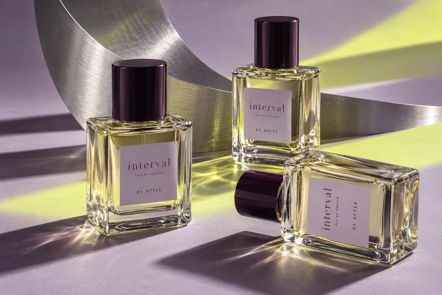
A fragrance for the moment between one thing and the next.
INTERVAL is an imagined fragrance house that turns a daily gesture into a small pause. Instead of selling a new version of yourself, it invites you to notice where you are.
The identity takes that thought literally: two lines, and the space between them. A quiet structure with an unexpected pulse of colour.
A LITTLE SPACE. A DIFFERENT STATE.
FRAGRANCE FOR THE IN-BETWEEN.Open spacing gives the name room to breathe. Two parallel lines turn a familiar pause into a repeatable brand signature.
An expressive serif brings intimacy. A precise sans serif organises product information. The contrast keeps the world warm and easy to navigate.
Plum anchors. Lilac softens. Chartreuse interrupts. A compact palette with a deliberate change of pace.
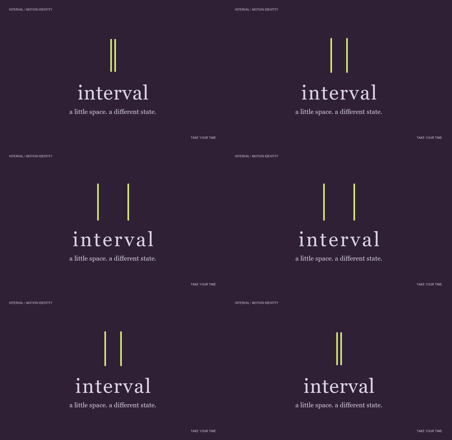
The lines expand, hold and return. Letter spacing follows the same pace. A six-second loop carries the central idea into digital touchpoints.
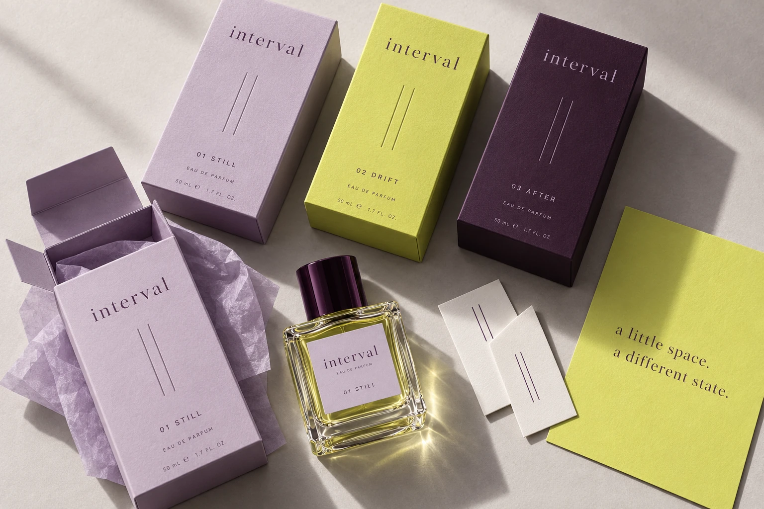
Download the motion study ↓Number, name, pause. A simple hierarchy makes the collection feel connected while giving each scent a distinct mood.
For coming back to yourself.
IMAGINED SCENT DIRECTIONFor letting the day unfold.
IMAGINED SCENT DIRECTIONFor the moment that stays.
IMAGINED SCENT DIRECTIONPackaging is a visual concept. Fragrance notes are creative directions; no formula, efficacy or production claims are implied.
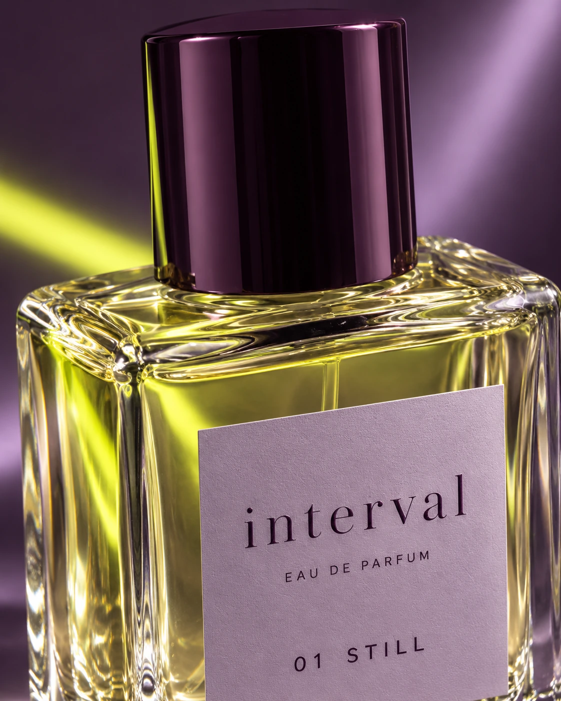
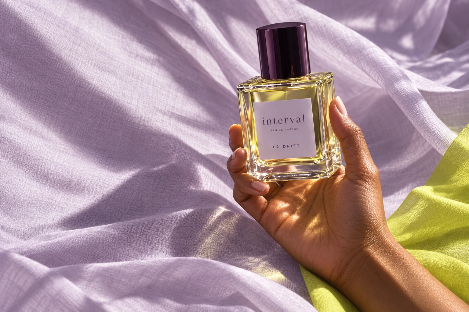
Heavy glass catches the light. Soft paper creates a tactile contrast. A glossy plum cap gives the composition its visual anchor.
The proposed finishes carry the same tension as the identity: precise and sensorial, restrained and expressive.
Natural light, tactile surfaces and a human gesture bring the idea closer. A consistent photographic language gives the brand a life beyond the pack.
The pause expands into a graphic pattern. Short, human language keeps the message direct across posters, social content and launch materials.
The system stays recognisable at every scale. Product imagery, open typography and concise language build a consistent expression from packaging to a mobile launch experience.
Illustrative digital art direction. This panel is a design application, not a functioning fragrance shop.
A short AI-assisted studio-light study based on the packaging image. Play to watch.
From a pair of lines to a complete brand world, INTERVAL shows how one considered idea can connect identity, packaging, imagery and motion.
INTERVAL is a fictional, self-initiated portfolio project created by Nour Eddin. Product and campaign images are AI-generated. The brand system, page layouts and motion study were developed for this concept. It is not commissioned client work or a commercially launched product.
Reference studies: Mavemade, Tower 28, Stoned Fruit and The Optimist by Verena Michelitsch. Studied for presentation and the breadth of a brand world. All project imagery shown here was created for INTERVAL.