ANYTIME
IS A
GOOD
TIME.
ODD HOURS BOTANICAL SODA ↗
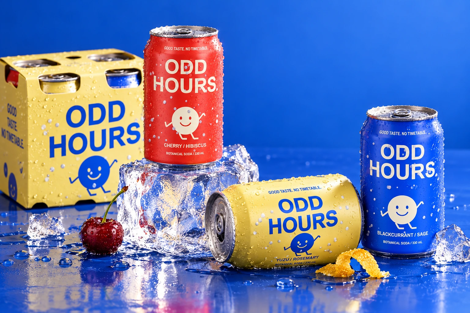
A bright, characterful soda brand for people whose days don’t fit neatly into boxes.
The brief: make a new botanical soda feel recognisable, approachable and full of personality. The answer: a name with a point of view, a wandering clock character, and a colour system that turns three flavours into one family.
THE OPPORTUNITY → ONE IDEA THAT WORKS ON A CAN, A SCREEN AND A CAFÉ COUNTER.
One consistent hierarchy: brand, character, flavour. The palette does the organising; the personality holds the family together.
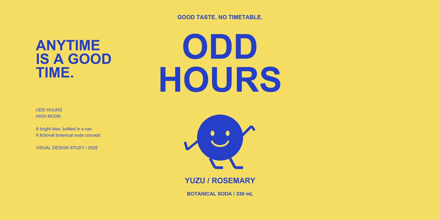
Curvature, materials and light change how a design is experienced. A real 3D model makes those decisions visible before the product exists.
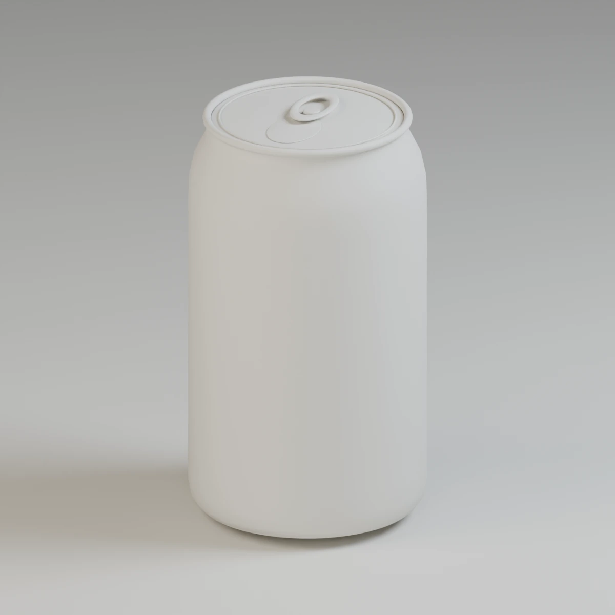
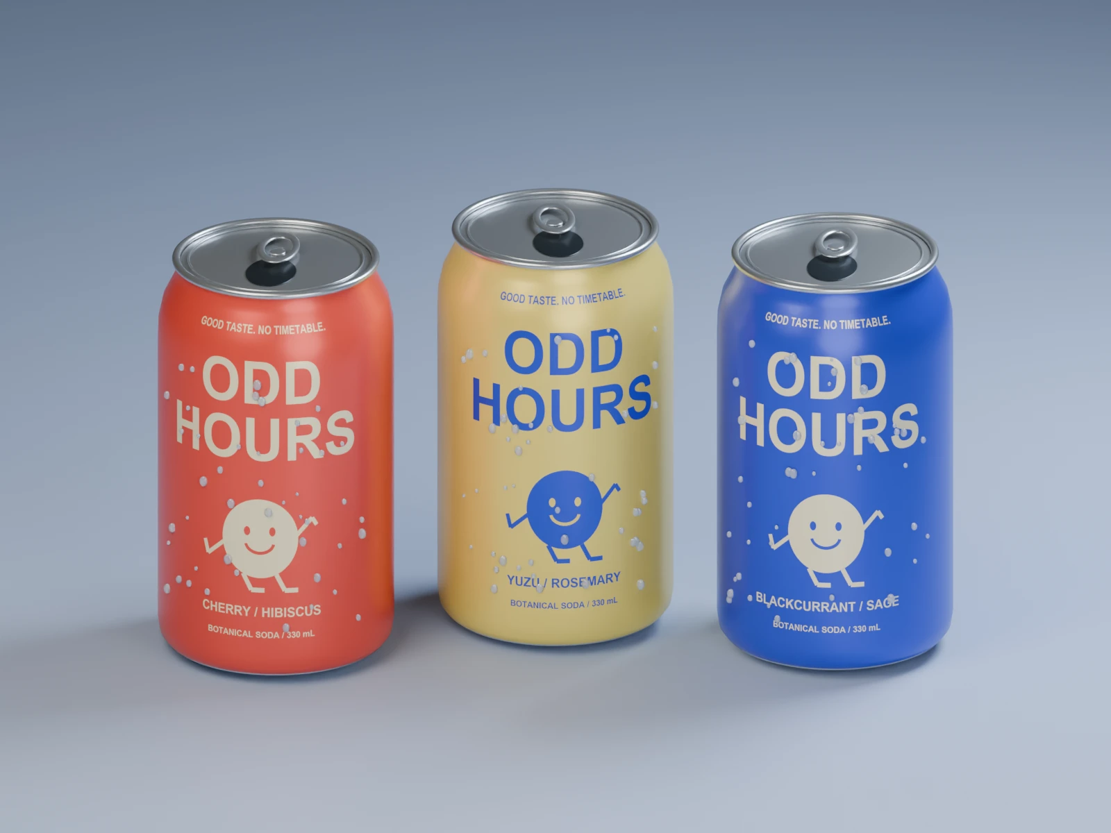
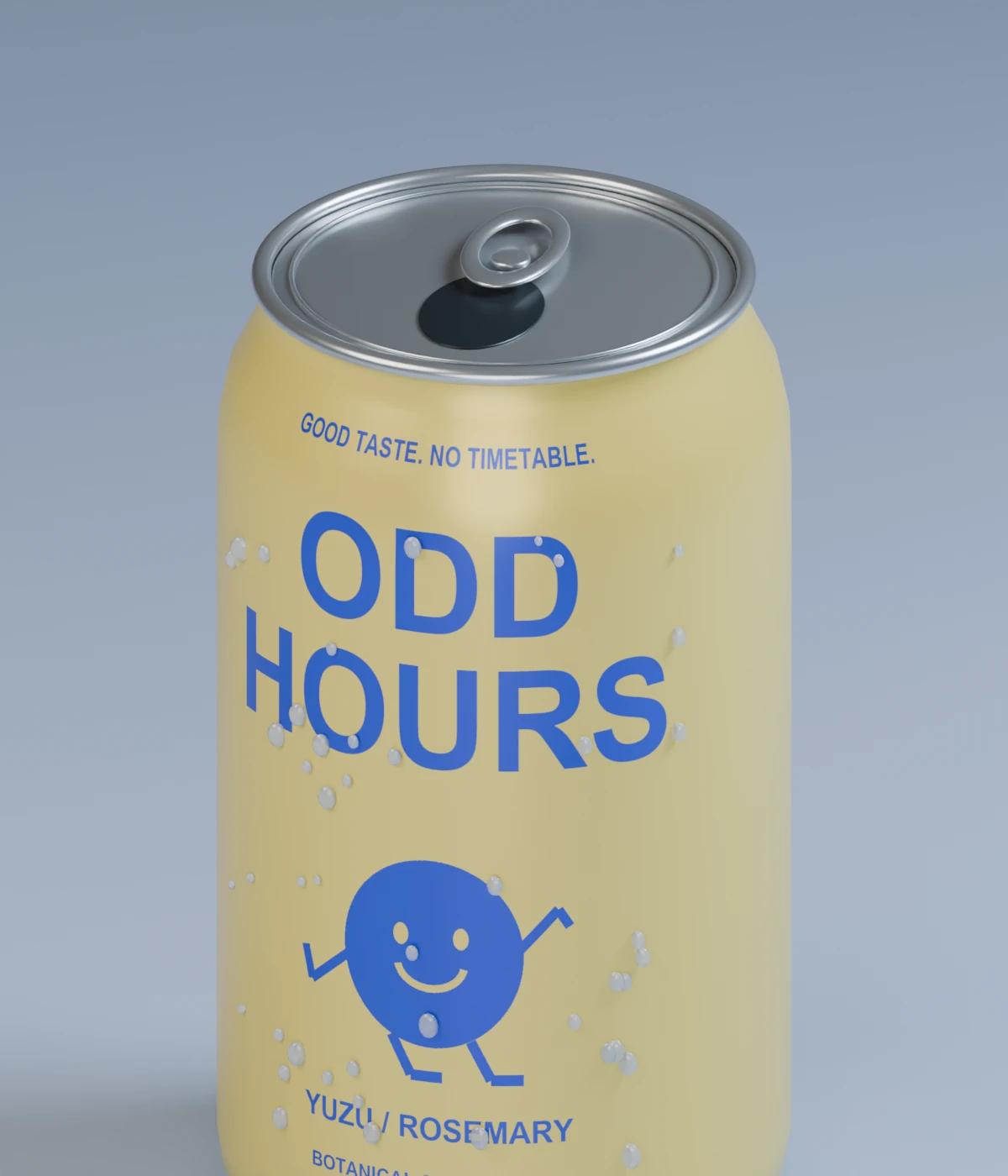
Light catches the rolled rim. The label follows the curve. Condensation gives the can a cold, tactile feel.
These details help a brand picture its product clearly—and create a consistent visual library for launch.
The same 3D model becomes a rotating product asset. The typography, character and back panel stay attached to the object throughout the turn.
One reusable scene can support still images, close-ups and motion across a launch.
Download the turntable study ↓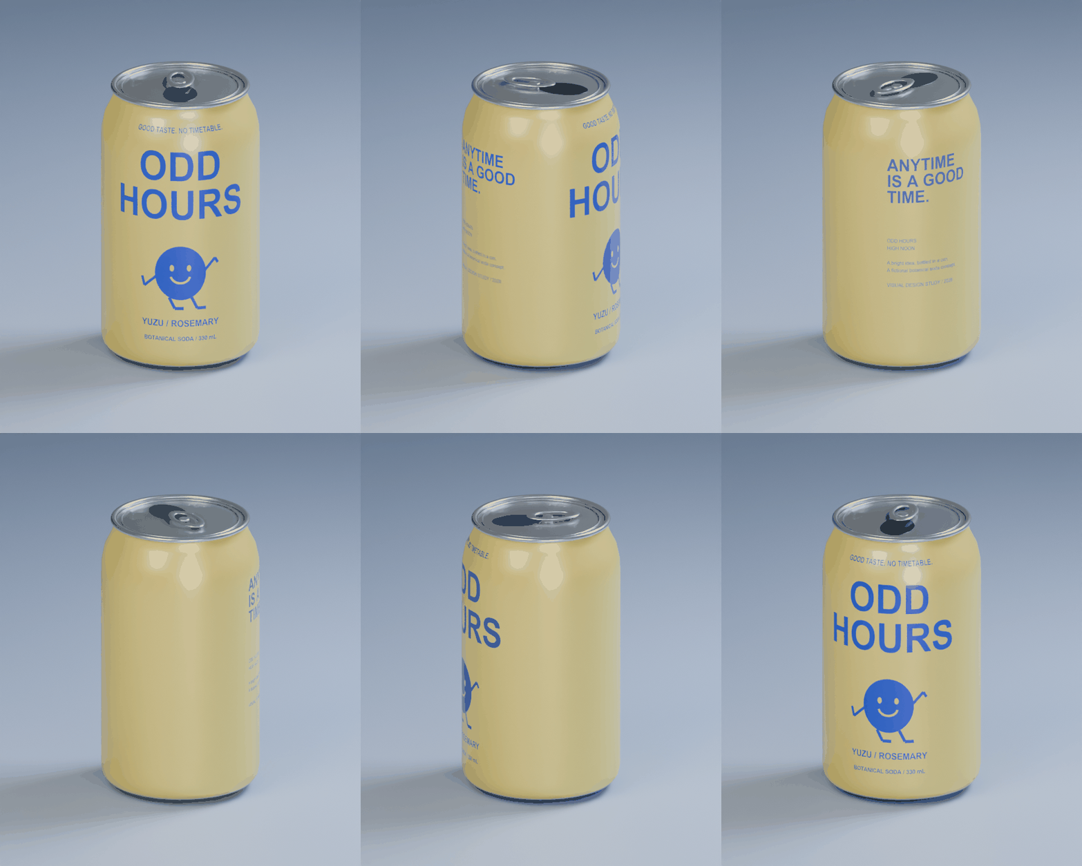
The identity extends into multipacks, posters, retail surfaces and campaign imagery. Every touchpoint feels like part of the same story.
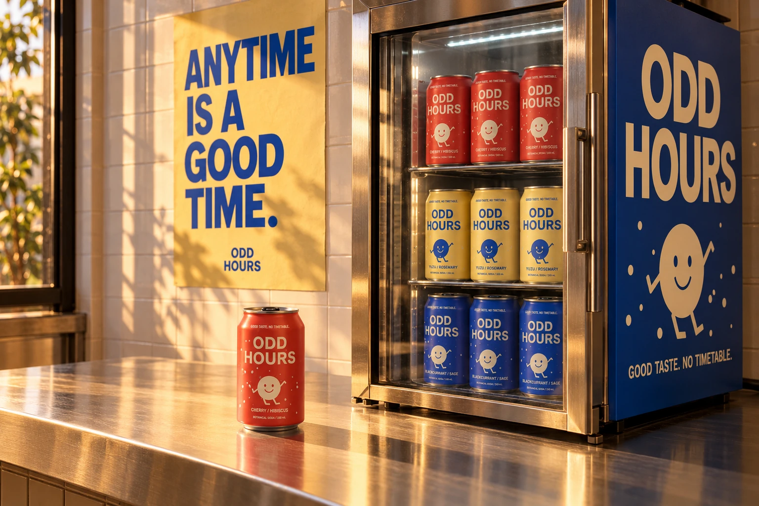
Oversized type, an optimistic character and a simple message. A small set of recognisable ingredients, ready to move across formats.
A clear visual system that gives your brand a consistent voice across its touchpoints.
Packaging concepts and 3D product visuals that make an idea tangible before launch.
Campaign imagery, motion and reusable assets that carry the idea into the world.
ODD HOURS is a fictional, self-initiated concept developed for Nour Eddin’s portfolio with AI assistance. Can geometry, mapped artwork, studio renders and the turntable were created for this project. The campaign scene and café environment are AI-generated visual concepts. This is not commissioned client work.
Creative scope: naming, positioning, visual identity, character artwork, packaging design concepts, procedural 3D modelling, materials, lighting, motion and campaign art direction. Editable artwork, Blender source and GLB models are included in the project handoff.